
An important part of what I do as a designer is helping clients define their style and preferences. After gathering some initial intel, we typically present clients with two or three well-thought-out design schemes — as we did recently for new clients. The empty-nest couple just downsized to a townhouse and wanted a fresh start in their living room, among other spaces.
The living room’s dominant architectural feature is a nook with a wide bay window and a pair of side windows. Here’s a look at the space with our proposed furniture plan:

Highlighting the bay window was a goal from the get-go, and we began the search for a fabulous fabric that would not only beautifully frame the window but also set the tone for the entire space. We often use a colorful, patterned fabric as a design springboard.
We kicked off the process with a client visit to the Washington Design Center. There, I pulled various fabrics and gauged the couple’s reaction. Certain themes started to emerge, most noticeably a fondness for flora and fauna. A kindred spirit, the wife is not afraid of color and pattern!
Armed with this feedback, we then developed three distinct schemes. Each proposed design began with an inspiration fabric (earmarked for the window treatments) that drove the other selections.
Scheme 1, dubbed Chinoiserie Charm, centers around a Zoffany print featuring peony branches in Chinese vases.

Keeping the cornerstone fabric’s feel and colors in mind, we pulled together complementary fabrics — solids and smaller-scale prints — for upholstery and accent pillows, wall-color and lighting options, and a rug recommendation.

The above slide is part of a PowerPoint presentation we prepared for our clients, but we always bring the actual fabric samples when we present. Technology can help to tell the story, but the slides don’t do justice to these lovely textiles. There’s no substitute for seeing and touching the real thing!

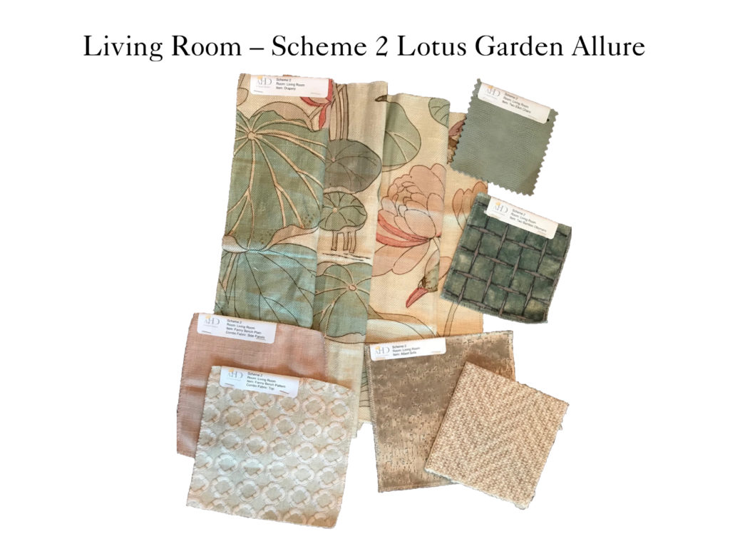
Scheme 2, which we named Lotus Garden Allure, features a stunning hand-blocked print from Lee Jofa.


Scheme 3, christened Butterfly Kisses, showcases a luxurious embroidered silk from Pierre Frey, in the spirit of 18th Century silk designs. A delicate lavender ribbon trails through a field of foliage and butterflies.

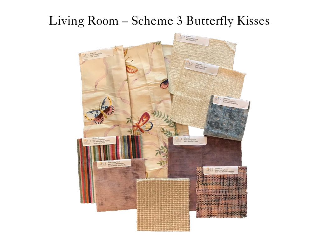

Our clients truly loved all three designs! But it was the elegant Pierre Frey silk that tipped the scales in favor of Scheme 3.
So with our design course set, my drapery workroom and I then put our heads together to come up with a treatment plan for the bay window. A valance combined with side panels provides a pretty frame yet also allows plenty of light to stream in.

The traditional valance is in keeping with the archival quality of the embroidered-silk design and with the age and architecture of the house. If you look closely, you’ll see that we considered two different styles for the valance’s curves. We ultimately selected the simple, clean style on the right.
As the rendering also reveals, an accent fabric in solid lavender will serve as the leading-edge trim — a custom detail that pulls out the ribbon’s hue and relates to the wall color (we tested all four paint colors in the space and chose Benjamin Moore’s Slip AF-605, a luminous lavender-gray). Here’s a glimpse of the bespoke trim with the drapery fabric:

The living-room design is taking shape, and I cannot wait to see all the beautiful elements come together. We are also busy at work on the couple’s dining room and powder room. This drop-dead-gorgeous wallpaper from Designers Guild, soon to be installed in the powder room, is too amazing to keep under wraps:

I love how it flows so nicely with the living-room selections! This wallpaper really embodies the sophisticated yet fresh look we are creating in our clients’ new home.
We are working to complete parts of this project in time for the holidays. How about you? Are you rushing to finish design projects before guests arrive?
 A. Houck Designs Makes List of Virginia’s Top Designers