The power of paint is undeniable. The color we choose for a space’s four walls plays a huge role in creating the mood within. And the ceiling can be called upon to heighten that mood. There’s a whole wide world of paint color options for that fifth wall beyond Ceiling White.
How we treat a ceiling depends on the other elements at play in the space. One thing is for sure, though: the ceiling is an integral aspect of the design. Even if we opt to bathe a ceiling in white, we choose the shade carefully.
But recently, white was the furthest thing from our minds as we updated our clients’ powder room. We wanted to create big drama in the tiny space, so we started by covering the walls with this over-the-top, floral paper from Designers Guild (I gave you a sneak peak of it back in October in this post about our plans for the living room in this DC home):

Suffice it to say, this wallpaper introduced plenty of wow-factor all on its own. We decided to up the ante, though, by pulling one of its lush shades of green for the ceiling color (Grenada Villa 690 by Benjamin Moore).

Now guests feel as if they’re entering a secret garden as they step inside. The verdant ceiling adds the right combination of elegance and energy to the space — and the stunning crystal chandelier by AERIN for Visual Comfort doesn’t hurt either!
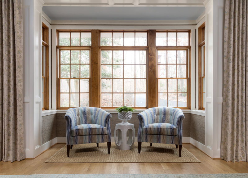
Not all of our ceiling-paint choices are quite so bold. In a Northern Virginia great room, we paired neutral walls with a soft blue ceiling (Jubilee 6248 by Sherwin Williams).

 Great Room Photography: Jenn Verrier
For this great-room ceiling, we pulled a color — blue, in this case — from the room’s textiles and other design elements but lightened it by several shades to achieve a pale wash overhead. If you missed our earlier posts, you can read more about this great-room design here and here.
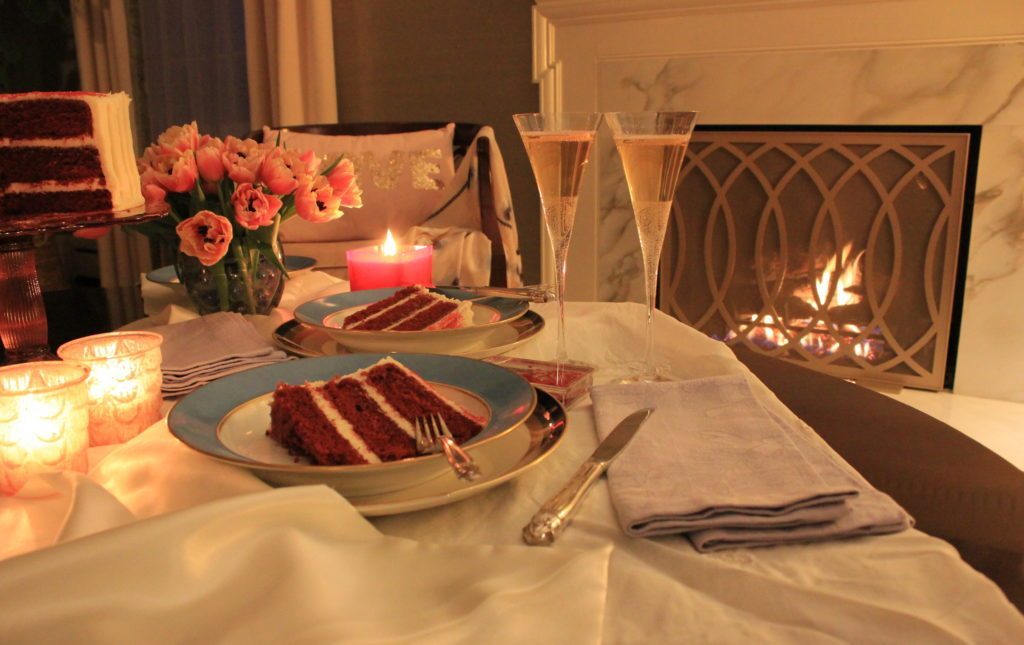
We also took poetic license with the ceiling in the bedroom we conjured for the 2016 DC Design House. Dubbed the Mademoiselle Chambre, the bedroom design was inspired by Paris and created for our imagined muse, a French teenager transplanted to DC with her diplomatic parents. Bright pink accents abounded, and we carried a toned-down version (Farrow & Ball‘s Calamine 230) onto the ceiling.


The hue you choose for the ceiling can complement or contrast with the wall color — or even be a continuation of the wall color. Enjoy the eye-candy curation below of fabulous spaces, created by top designers around the country, boasting colorful ceilings…from saturated to subtle.


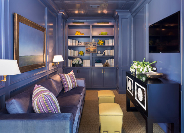

Buckingham Interiors + Design, Julia Buckingham


Clearly, we are not alone in our appreciation for the importance of the fifth wall! Wishing you all a colorful 2019!
 When a Prized Collection Sparks a Design Approach